On paper
I read programming books on paper.
There, I said it. Not every one and not exclusively, but still. In the age of weekly screencasts, live coding streams, and bite-sized chunks of knowledge delivered via Twitter, I read programming books. On paper.
It’s not a mere sentiment. The smell of paper does not teleport me to a better time of wizards and fair maidens. I choose paper for its strengths. However, these strengths are often vastly underutilised. Now more than ever, it seems.
The paper book nowadays feels more and more like an afterthought. This here is my plea to the publisher and my humble contribution. Let’s make paper great again.
What this is not about
This post is not a discussion of “paper vs ebook”. I will not be claiming one is better than the other. Ebooks are a separate matter altogether. And although I do have an opinion about them, this is not the place.
This post is also not about content. Some books lend themselves to paper format better than others. I will pick up a decent reference on paper more likely than a great tutorial. But that’s not the point here.
And although there is one book that started it all, I don’t want to single any one out.
So what about then?
A few weeks ago I purchased Android Programming: The Big Nerd Ranch Guide. I wanted to brush up on my Android fundamentals and this felt like the right one. I knew the content was bound to be good. I had read and loved the classic Cocoa Programming for Mac OS X a few years ago and I’d seen multiple recommendations online.
Upon receiving the book, my heart sank a little bit.
Soo disappointed with formatting in @bignerdranch #android guide. Messy wall of black text. Pages indistinguishable from one another...
— Łukasz Adamczak (@lukasz_adamczak) June 9, 2016
And since I hate unconstructive criticism, I got to thinking. What is it that makes some books so great on paper? How come one stays by my side on the desk while another gathers dust and barely ever leaves the shelf?
These questions are the foundation of this post. I cleaned up, organized and wrote down my thoughts. Here they are, for your consideration, listed as a set of tips for the publisher or the publisher-to-be.
The paper (dis)advantage
All the tips below stem from one key factor. You, the publisher, control “the screen”. You know the content and you understand how to present it best. You format the text and lay out the figures, tables and images. I don’t have a say in this. There’s no window to resize. There’s no keyboard shortcut to increase the font size.
By the time the book arrives at my doorstep, all these choices will have been made. And I’m fine with that.
But there are good choices and bad choices.
Tip 1: Don’t make me think
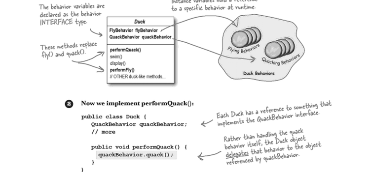
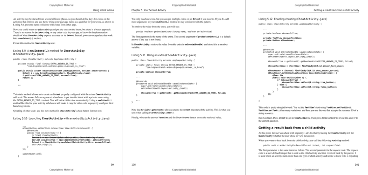
Learning a new subject is hard enough. Please don’t make it any more difficult by adding work for my eyes and brain. At a single glance I should see where a paragraph ends and a code listing begins. I should not expend energy trying to determine which line is the figure caption. A careful application of proximity, alignment and contrast should make these determinations instant and effortless.
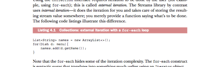
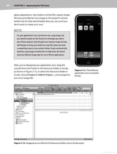
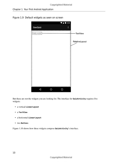
With inadequate contrast and no help from alignment or proximity, the distinction gets blurred:
Tip 2: Guide my attention
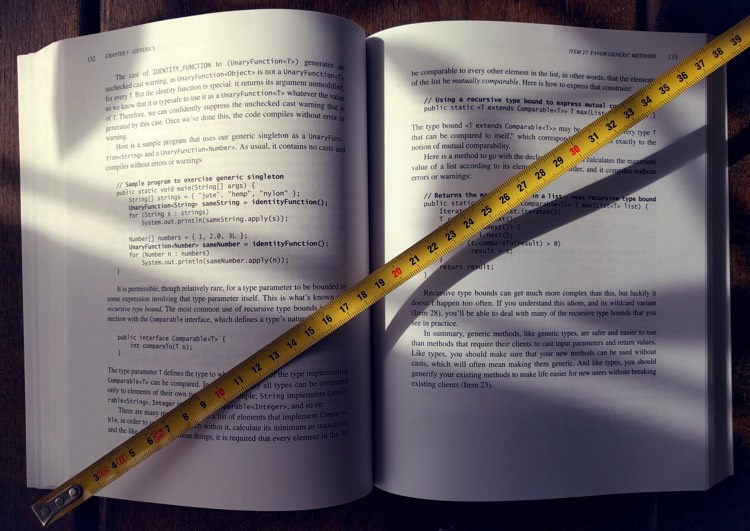
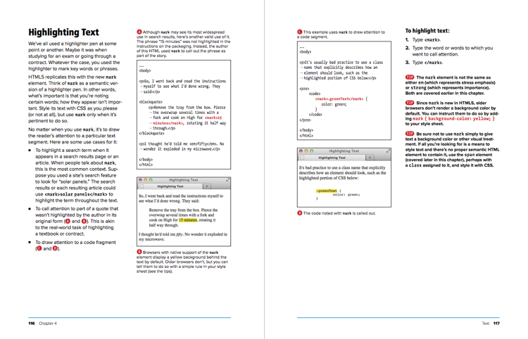
Whenever I read a new chapter, I like to do the following:
- Set a timer for two minutes
- Scan through the entire chapter before time runs out
- Try to get a good overview of what it’s about
For an average 30-50 page chapter, two minutes should be enough to find out the following:
- What will I learn?
- What is the overall structure of the chapter?
- What are the most important pieces?
To facilitate this, the good books make it easy:
In others, way too many elements are fighting for my attention:
Tip 3: Use the tools at your disposal
Sure, you can just paste a block of code with inline comments and be done with it. But you could go that one extra step. Maybe point at it instead?
While you can’t embed a video in a paper book, with a little thought you can demonstrate motion or interaction just fine:
And if you’re feeling especially brave, you can take it to another level:
Tip 4: Lay it out
One specific tool at your disposal is page layout. Consider these two examples:
Makes you wonder if a 600-page book really needs to be 600 pages long. Could this have been laid out smarter?
Tip 5: Make it memorable
This is a byproduct of conscious layout and deliberate use of design principles. But it deserves a secion of its own. Make the pages memorable. Why does this matter?
A memorable page can be found quicker. Think about it: paper pages are constant. Whenever I look, page 167 will always look the same – it’s the one with the yellow screenshot in the corner and a “LEARN MORE” box further down.
This is a good thing. I can easily find the page on a quick scan. I don’t need to read any letters. I don’t need to make sense of anything. I spot the yellow outline and I know I’ve arrived. This is how my mind deals with a lack of Ctrl+F function.
However, this gets harder when subsequent pages have few discernible elements:
Bonus tip: Consider the entire screen
A paper book comes with its own “screen” built in. A large, high-resolution, high-contrast, glare free screen that reads perfectly in direct sunlight.
And when I say “the entire screen”, I mean this fifteen-inch beauty:
Few books consider this, but the ones that do hold a special place in my heart. To me this is what differentiates a real book from a long Word document cut into evenly sized pieces.
I’ve long been partial to the HTML and CSS Visual Quickstart Guide, which demonstrates this well:
Now let’s make it clear - this gets you extra credit. Few books go this extra mile and many are just fine without it. But please, pretty please… with sugar on top, at least contemplate these:
- Did you think about even and odd pages?
- Is the code listing visible in its entirety or will I need to flip that one page back and forth?
- Can I lay the book flat in front of me and continue my work?
Resources
Samples in this post come from the following books:
- Android Programming: The Big Nerd Ranch Guide by Bill Phillips, Chris Stewart, Brian Hardy, and Kristin Marsicano
- Beginning iPhone Development: Exploring the iPhone SDK by Dave Mark and Jeff LaMarche
- Core Java for the impatient by Cay S. Horstmann
- Effective Java, Second Edition by Joshua Bloch
- Head First Design Patterns by Eric Freeman, Elisabeth Robson, Bert Bates, and Kathy Sierra
- HTML and CSS Visual Quickstart Guide by Elizabeth Castro and Bruce Hyslop
- Java 8 in Action by Raoul-Gabriel Urma, Mario Fusco, and Alan Mycroft
Please note I have deliberately selected the samples to present the good and the bad. Any conclusions about the books based on the samples alone would be misguided and unwise.
For a wonderful explanation of design principles, I wholeheartedly recommend the classic Non Designer’s Design Book by Robin Williams.
Following up
How do you feel about paper? Do you prefer a hard copy or don’t care one way or the other? I’d love to continue this discussion in the comments right here, on Twitter or anywhere else. Let me know!
If you find this topic interesting and the discussion worthwhile, please share this post. I’m looking forward to any feedback.